Destroyer (battleship) BLAS DE LEZO / Mixed Technique on Board, 40 x 90-cm.
Once I collected a number of photographs and schemes, I carried out a further study on the Destroyer ‘Blas de Lezo’. I had to work so really hard and I devoted some time to the task as the side view was really complicated (I intended both the drawing and the painting to be really accurate).
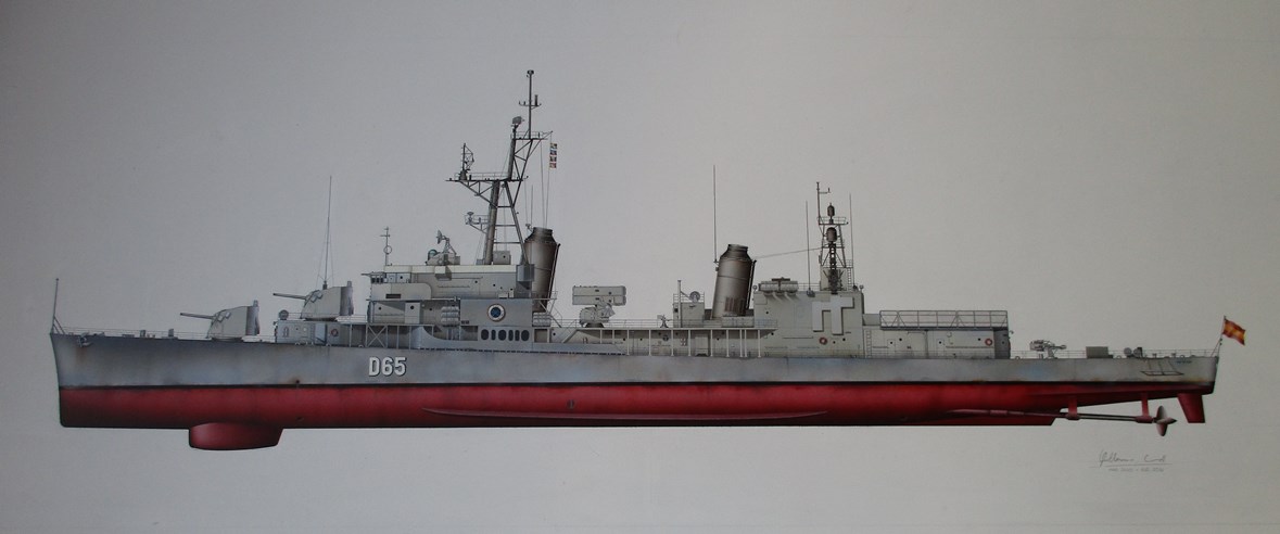
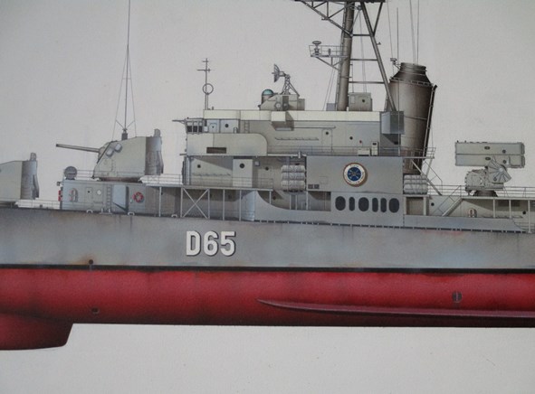
This work was commissioned by Javier Reines, a good friend of mine, who wanted a much special present for his father Francisco Daniel Reines Bertomeu. In 1974, Mr. Reines Bartomeu was a member of the crew entrusted collecting the battleship in Jacksonville (USA) to bring it back to Spain.
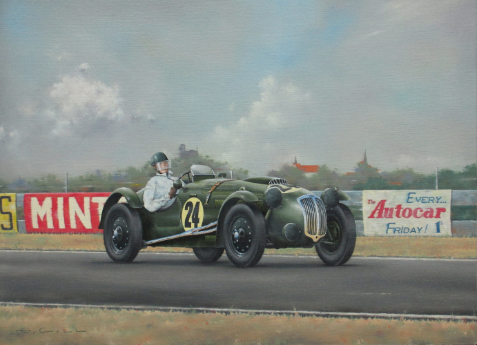
“IRON BUTTERFLY” / Oil on canvas 42 x 30 cm.
Frazer Nash is one of the most mythic names in the motor racing world. The British firm had always given to its models names related to well-known car races. The best known being the Le Mans Replica, 34 units were built during the 1948-1953 period, usually equipped with a six-cylinder Bristol engine.
Among Frazer Nash’s successes in motor racing we need to mention the much deserved third position in 24 Hours of Le Mans race in 1949 and both the victories in Targa Florio in 1951 and in 12 Hours of Sebring in 1952.
Frazer Nash also entered different competitions that took place in the United Kingdom such as: Daily Express Grand Prix, British Empire Trophy or, as we can see in the painting, the 9 Hours of Goodwood in 1953. There, the team of both Melvin and Kenneth would end up thirteenth.
I chose this car in particular thanks to my friend Luis Amarillas, an outstanding car modeller. He gave me three photographs of this very model, one of these in full colour. It is a LM Replica with its usual embodiment but including an extra beacon assembled close to the grille. According to the pilot’s tastes, the cars could be added some modifications that in some cases could so really change the lines of the original design. The body work is painted dark green (British racing green) with black rims. The glasses of the beacons are protected by some canvas cover and the rings of the numbers are depicted light yellow (the bonnet ring is not centred but lightly on the right).
Some buildings are visible by the line of the trees in the background, this helps to depict the real perspective of Goodwood, particularly in a section called St. Mary’s. The billboards match with the ones in this period and give further detail and colour to the painting. The whole has been achieved by making a soft sweeping effect using a paintbrush.
The pilot is supposed to show a particular approach and at the same time is due to look anatomically in proportion. The one in the painting is wearing the usual white coveralls and a helmet with a Plexiglas protection assembled to the visor.
I really think that cars a far more difficult to paint than aircraft (considering both drawing and colouring). It is necessary to take into consideration the general perspective and more particularly the wheels, the background, the many details of diverse textures and all the sponsors’ labels for successfully depicting a modern racing car.
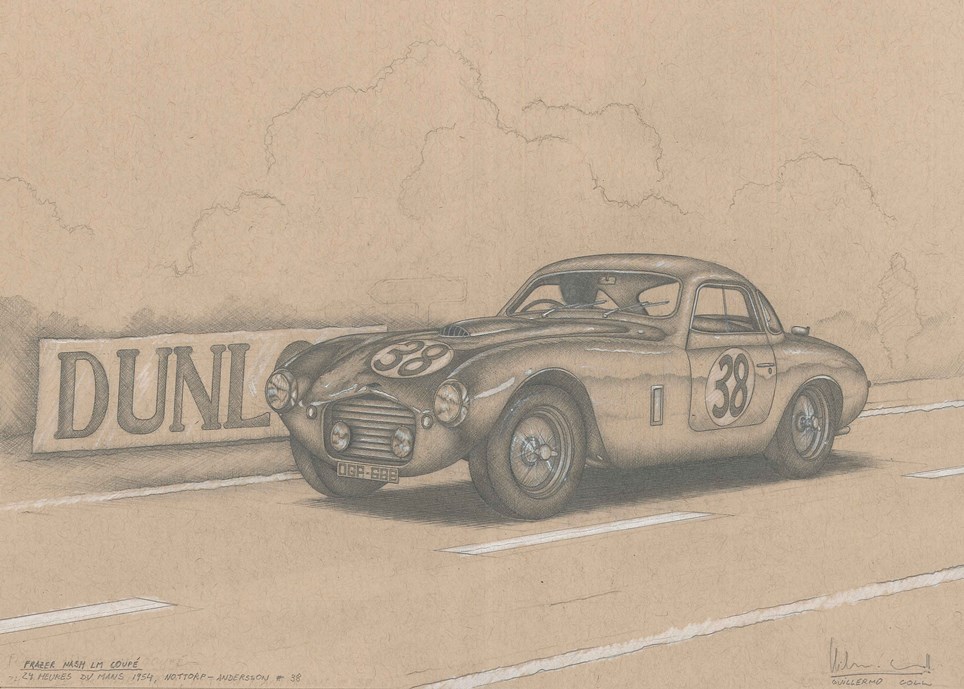
FRAZER NASH LM COUPÉ,
Pencil and white pastel colour on Strathmore paper,
20.5 x 28-cm
I often employed a pencil-holder with 2-mm leads (I work with the usual three hardness degrees, that is: 2H, HB or 2B). Sometimes, I achieve the drawing by melting with my stump or with a cotton bud or I by just drawing a tiny weave made up of parallel either interlaced lines. This technique seems so industrious but it is much easier than expected, work can be controlled in a quick simple way. My secret: having well-sharpened pencils and a steady hand plus drawing very small strokes. Different shades will appear depending on the hardness of the pencil, the pressure of the pencil tip onto the sheet of paper and will be as much thicker depending on how tight the strokes are. At the end, some shine can be enhanced and some details added by applying white touches.
RENFE-MTM-242 F 2001/10 / Acrylic on paper, 58 x 22.7 cm
During my incursion in the advertising, I was able to specialize in photograph retouching techniques, mainly based on the use of grey, white and black colours. The main challenge was achieving absolutely flawless original works since manipulation and retouching have to be sophisticated enough to remain unnoticeable.
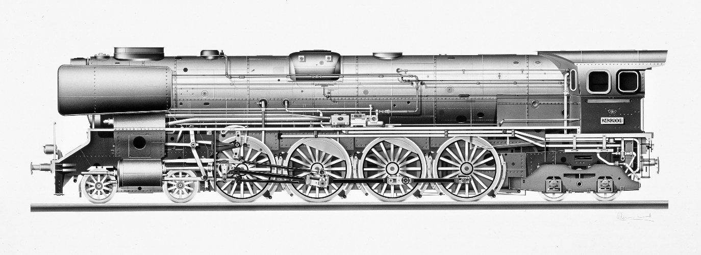
On the other hand, I need to point out that the photographic paper, covered by a thin film, wasn’t really the right support for this. In fact, most of the time we decided not to use the usual adhesive material for airbrush as this used to rub off or to spoil the film. We much preferred to employ transparent acetate to make masking pieces fixed by some tiny magnets while the original was put onto an aluminium plate.
I really enjoyed the experience and this resulted on me making some drawings like this “Confederacion”, one of the biggest and most outstanding steam locomotives that were in service in Spain.
The primary drawing was achieved with a thin-ended ball pen; since only a very simple scale drawing containing the basic lines and contours was available, I had to base my work in some historical photographs.
The “colour” was a highly watered grey shade, slightly dyed with violet. Different colour gradations will be achieved by applying more or less coats of paint using the airbrush tool. Apart from a few details, the shining let us see the white colour of the paper sheet so these seem much more natural and bright.
This drawing is dated on January 1993 and belongs to a private owner.
SHARP-STEWARD 120-2112 / Acrylic on paper, 53 x 35 cm
This is another example of B&W illustration featuring a Spanish vapour locomotive. This time we have chosen a much outstanding machine which was in use in 1854. The grey hue base colour was slightly tinted using reddish brown. Old airbrush papers such as Canson Aerograph and Zanderstern were added a thin layer of putty which was so really helpful to depict tiny white shining spots; it was necessary to scrape it with the tip of a blade or even with an eraser (a pencil with rigid rubber ending usually employed for correcting typewriter mistakes).
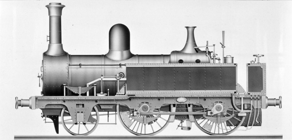
This illustration is dated in May 1994.
All the images are copyright (c) 2022 by Guillermo Coll. All right reserved. Copy and distribution are forbidden
